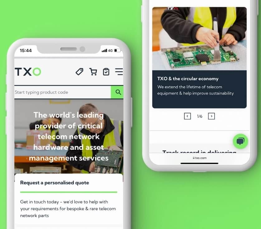
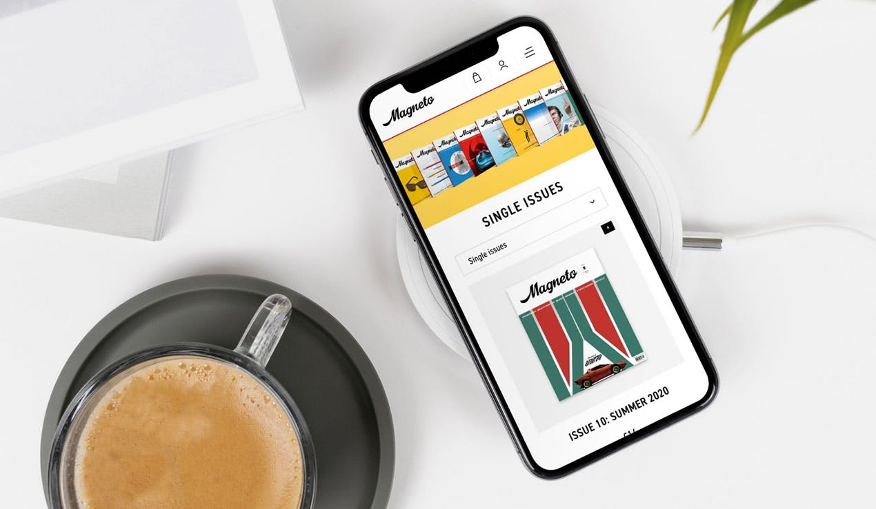
With around one million products, TXO's huge stock of telecom network equipment combined with their extensive knowledge and expertise, set them apart from the rest. This global business needed a stronger identity, so we worked in partnership to make sure that their brand has a high impact across both digital assets and printed material.


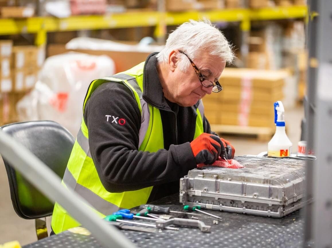
Standing out
from the crowd
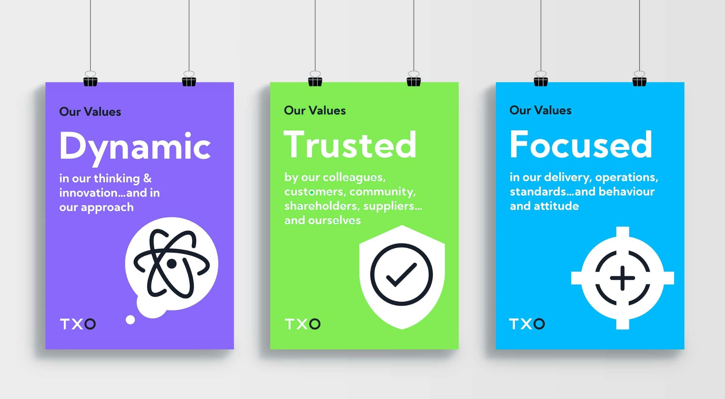
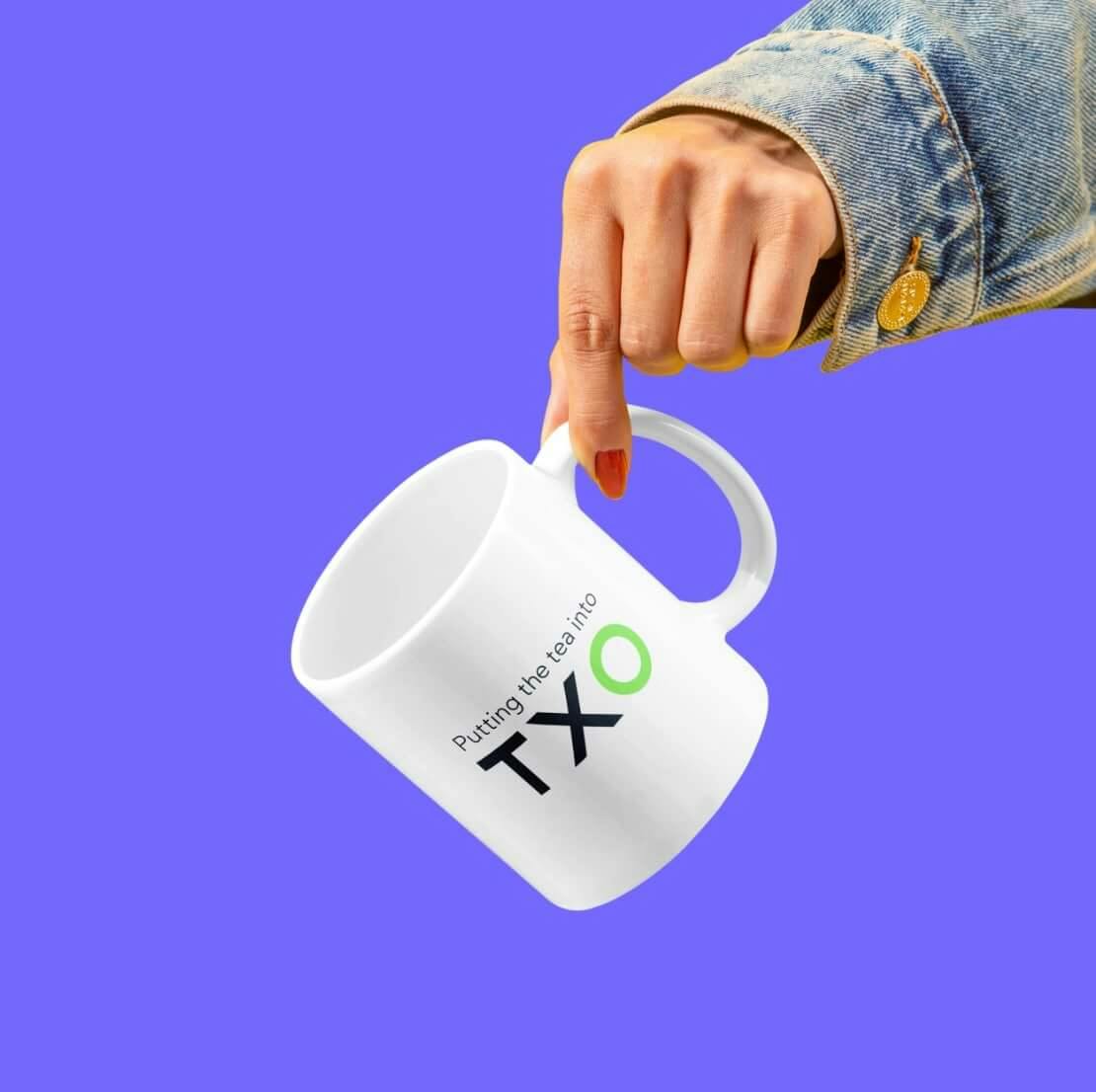
We crafted an evolution of TXO's existing brand identity that retains their recognisable green and refreshed the wider colour palette with the addition of bright purple, blue and red to make the whole brand identity more eye-catching and contemporary and elevating them apart from their competition.

TXO Green
Digital
Hex - #82ED6A
RGB - 130, 236, 85
CMYK - 68,0,84,0
Pantone - 7488C


A fresh new site
Using the evolved brand identity as the foundation, we designed and built a new website for TXO including moving from the previous domain of txo-systems.com to a much coveted three letter TLD—txo.com. The new website has many new facets and features along with a catalogue of over one million products. We'll be writing more about the technical challenge and solutions to be provided in another case study, so watch this space.


Bespoke styling
We created a bespoke icon pack and illustrative style exclusively for TXO, helping to further separate them from the crowd while reinforcing their unique brand identity.

“Working as an extension of our own team, CORE helped us to evolve our brand identity to better represent and position our business as we expand and grow into a highly competitive global marketplace. We love the work and perfectly reflects who we are today and where we want to be tomorrow (and beyond).”

